|
By Jeffrey Cohen
We have a two and three-stock long portfolio selected by the Chicago Quantum Net Score today that scores better than the top stock in our model individually. The edge is significant over the SPY. These stocks have been on a tear higher lately. They were up yesterday, and they are up pre-market today. What do we know about them? The first company offers buy now, pay later and personal consumer loans at point of purchase. The second company is an emerging biotech stock that looks alot like Corbus Pharmaceuticals, and is working oncology cures for solid tumors. The third company offers an eCommerce platform for residential real estate transactions. The fourth stock that did not quite make the list is a bank to consumer digital advertising platform. The fifth stock that did not quite make the list is a seller of used cars that also holds loans made to consumers on the cars they purchase. This overall portfolio is highly exposed to credit delinquency and interest rates, and relies on consumers to keep spending and borrowing, while staying current on their loans. It also has a micro-cap biotech company that likely has been 'tape painted' or laddered lately to keep the risk-reward balance optimal. We saw this in the past with AeroCentury (ACY), which was a closely held company out of China which showed a good technical rating even into bankruptcy. Buying all five stocks instead of just two removes about 10% of the edge of the portfolio. Technical Notes: We observe a few key characteristics. The top stocks to short (or sell, or avoid) are almost entirely below $250mm in market capitalization, and a majority of them have declined 50% or more over the past year vs. their average closing price. These have already fallen significantly. These are falling knives. A full third of the stocks to buy and hold individually have also fallen 50% or more in the past year. Good bargains or stocks going to zero? Not sure, this is where due diligence comes in. Volume in the 3001 stocks that made it past data validation today is 101.8% of the average volume for these stocks over the past year (we did an average). It is tricky that on a day when the market rose, the volume was not higher. The average dividend yield for the 3,001 stocks was 1.73%. The average BETA of all 3,001 stocks was 1.175, or 17.5% higher than the S&P 500. This is likely indicative of the benefit of holding a synthetic, passive index that is market capitalization weighted. It reduces risk, as it is harder to move the price of large stocks. If the 'best' stocks in our model are the most risky, and reflect a bet on the health of the lower-end consumer (buyer of used cars, direct selling homes, and borrowing to buy on eBay or Amazon), then this market is pushing risk to the extreme. There is profit opportunity in the short term, but it is super-sensitive to macroeconomic performance. The Chicago Quantum Net Score picks for September 29, 2023 are a bet on the success of the US economy. Good luck to everyone. Good luck to all. Catch our video this morning on Youtube, here.
0 Comments
By Jeffrey Cohen Today, the market reversed course and stopped declining. In addition, we saw evidence of short squeezes and higher-risk stocks advance.
We saw this last night in our model run. It suggested the same types of risky, new economy stocks with much higher conviction. The model ran with almost 40 'ticks' of edge or alpha over the S&P 500 Equity Index ETF (SPY). We also saw the base, underlying metrics for our top factors change during the day to support the shift. It isn't supposed to work this way, or is it? Market directions shift, underlying factors move sympathetically, then by the end of the day the equity indices have moderated their gains, faded their runs, and the day ends having even lower volatility than it did. Time for a video to work through the details. Please check our youtube channel. Stocks are down this morning, but our model sees greater edge or alpha from long positions9/26/2023 Good morning, this is Jeffrey Cohen, President of US Advanced Computing Infrastructure, Inc.
The top stocks in our model have a larger edge than they did a few days ago. The edge is significantly higher. Why? Let's look at the details: 1. The best stocks in our model have a better CQNS score. This is driven by either higher expected returns, higher relative returns, and/or lower variance. What we see is lower all-stock variance for a portfolio of 3,010 stocks held evenly. This is the lowest variance we have seen, likely ever, at a level of 4.0 x 10⁻⁵. This is based on a power log (base 10) for the prior 253 trading days. If the 'best' long stocks have better scores, then portfolios (of multiple stocks) are currently better too. 2. The risk-free rate of return is higher by 0.002, so not very much, as the short-rates we use to set this are largely unchanged. You likely noticed the 10-year US Treasury yield up to 4.5%, but the shorter-term debt (1-month to 6-months) is largely unchanged. The market expected return to risk is up to 8.40% based on recent gains in the US equity indices. Expected future market returns are up to 15.65% over the next year. 3. The model is picking from 5 to 7 stocks in the long portfolio. This is consistent over the past few weeks, as there is advantage of finding stocks that zig and zag together, lowering overall portfolio risk. 4. The edge is higher. We see 31 ticks of edge or alpha over the $SPY S&P 500 Equity Index ETF. This does not mean you will make money by holding the long portfolio because the overall market may fall. However, you would have a better risk-return positioning than holding the $SPY. We suggest you hedge the risk of the overall market with either the equity index, or using the 'worst 3' short positions our model suggests. This is how we manage our CQNS portfolio for clients. GLTA We shared our Chicago Quantum Net Score long picks for the day. The edge is lower.
Good morning, this is Jeffrey Cohen.
Five Fast Facts:
1. Our quantitative model is less positive, less aggressive, and less attractive for holding stocks. The best, most controlled, lowest risk and highest expected return stocks just blew out their correlation. It was like the 'players club' that holds these top stocks (think ARKK) blinked. This reduced the edge, or alpha on our optimized long portfolio from 28 'ticks' to 18 'ticks.' This was not due to big picture changes. Expected returns, price volatility, and all the other metrics are relatively unchanged, yet the edge is lower. So, the best stocks are less good. 2. The 10-year US Treasury Note yield is up significantly, and although it is down three basis points this morning, it is still up significantly, at an 'investing cycle' high. Short rates have not changed. 3. Pre-market is broadly higher. We track portfolios. We create them, liquidate them, and recreate new ones. Today, pre-market, growth is up, bonds and banks are up, steel, mining and autos are up, energy is up. It seems universal, with only a handful of stocks lower in pre-market. 4. Our Chicago Quantum Net Score picks are similar to the ones we picked yesterday, but there are some smaller portfolios reaching the top of the list. Best portfolios of 17 to 18 ticks of alpha have between two and eight stocks. So, the best are in the same place, but there is less confidence. 5. Large cap stocks have been down for days.
This is what we are thinking about. The largest capitalization stocks are doing the worst this week. Growth and innovation are down. Advertising is down. Confidence is large caps has slipped. Even Eli Lilly is down.
The best stocks this week? The low growth, slow growth stocks like health insurance are doing well. In a tough market, investors cycle into stable, safe companies that are insensitive to economic changes. We noticed that United Healthcare is up most days. By: Jeffrey Cohen, Founder and President Chicago Quantum (SM) US Advanced Computing Infrastructure, Inc. Top findings from Friday, September 15 market close data:
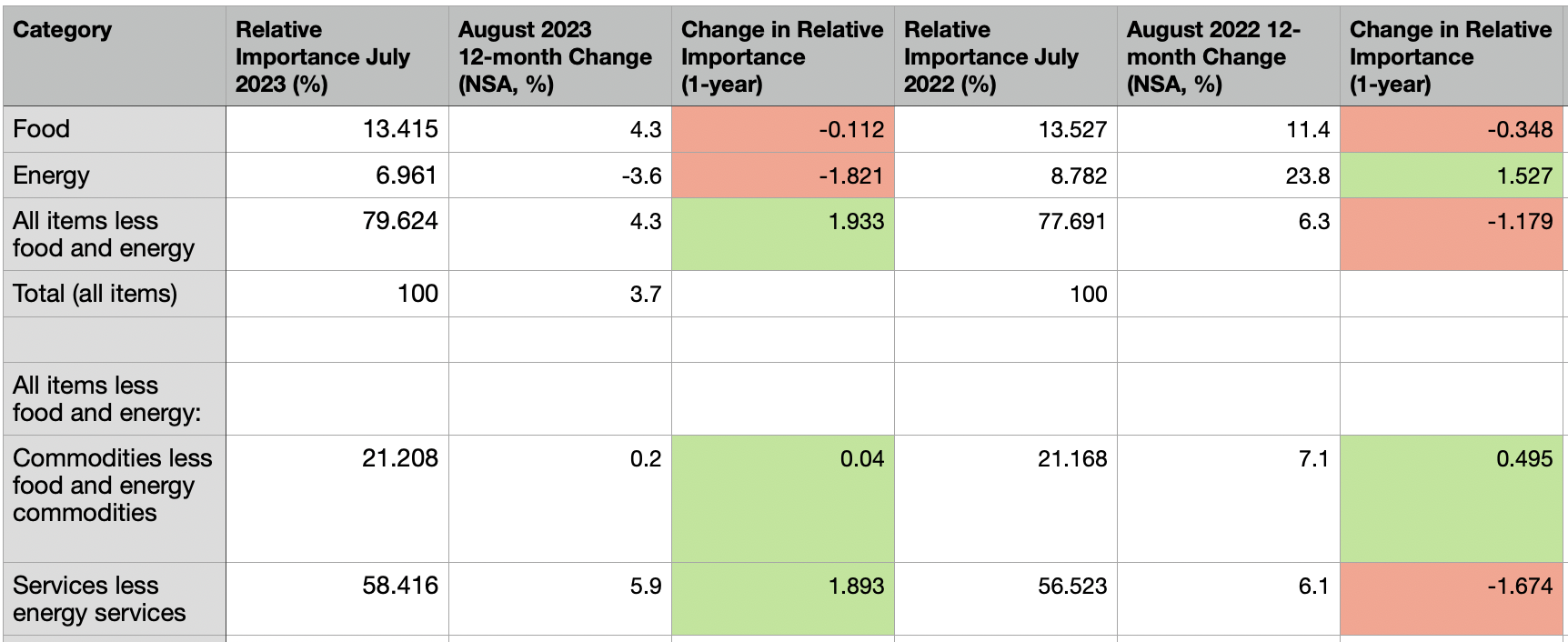
1. Expected market excess return (in addition to risk-free UST rate): 8.0% 2. Expected return on all 3,019 stocks: 15.14% 3. All stock variance: 4.067 x 10⁻⁵ 4. Top CQNS portfolio has 6 stocks and 25.3 ticks of edge or alpha over the SPY. The top 5 portfolios have between 5 and 7 stocks, and all have 25 ticks of edge. 5. The total market capitalization of the 3,019 stocks is $51.3T, down $0.1T on Friday. 6. There are 126 stocks that individually scored better than the S&P 500 from a Chicago Quantum Net Score perspective, and four of them have a higher actual dividend payout. $RILY $UNIT $JXN and $ARI. These are largely new names in this list. Our clients receive the actual CQNS stock portfolio picks, and these lists. Top 50 and Bottom 50 individual stocks Top 50 and Bottom 50 relative volume Top 50 and Bottom 50 relative price changes Top 50 largest and smallest BETA values (stocks and ETFs) Negative BETA values (stocks and ETFs) Excessively Positive and Negative skew (skewness) stocks Excessively Kurtotic stocks (leptokurtic or platykurtic) Finally, our clients get the results of the full run and a spreadsheet with all 3,019 stocks listed with the CQNS score, and other detailed metrics. We are starting a backtest experiment to show CQNS results over time. We did this a few months/years ago. Good luck to all. Jeff Good morning readers. This blogpost was written by Jeffrey Cohen, President and Founder of US Advanced Computing Infrastructure, Inc. d.b.a. Chicago Quantum. We document the change in relative spend by major category from 2016 to 2023 and draw conclusions on the elasticity of demand and where our best guess takes us for spend in 2024. In 2024, would expect weakness in retail, food & beverage, and services. Services will be weak because of entrenched inflation in that sector (~6% for 2 years). We expect flat demand in commodity goods, supported by near-zero inflation. Energy spend will rise in 2024 as prices are currently rising and demand is inelastic (hard to change demand in a short period of time). The August 2023 headline inflation reading of 3.7%, and the core CPI reading of 4.3%, indicate that inflation is not defeated, but is stabilizing at around 4% after dropping to the low 3s. What happened is that two widely consumed items are significantly more expensive, shelter and all energy (especially gasoline). For those who own cars, auto insurance is also significantly more expensive. September will likely be more of the same as the price of oil globally continues to rise, U.S. foreign trade in goods slows down, the world deals with natural disasters, interest rates rise (making capital more expensive), and both China and Japan continue to stimulate their economies with easy money. However, the biggest driver in the US in September will likely again be shelter and energy prices. Different regions of the country are facing different levels of inflation. Chicagoland (2.3%) has very low inflation, while the Miami metropolitan region (7.8%) grows significantly more expensive. Annual inflation is lowest in the Northeast (2.8%), then Midwest (3.4%), then West (3.9%), and highest in the South (4.1%). Our focus for this article is about what Americans are spending their money on. A focus on the weighting of the inflation data to reflect the importance of those categories. In short, the US Bureau of Labor Statistics' best guess on where every $1.00 is spent, excluding farmers, military personnel and those in institutions. In 2023, the American consumer spent less on energy and allocated that spend to services. Services are made up of Shelter, Medical Care and Transportation. Here is a snapshot for the past two years, with changes from the prior year.
We see different patterns each year of primary spending changes: 2023: Services + 1.9%; Energy -1.8% 2022: Energy +1.5% and Commodity +0.5%; Food -0.4% and Services -1.7% 2021: Energy +1.1% and Commodity +0.6%; Food -0.3% and Services -1.4% 2020: Food +0.9% and Commodity +0.8%; Energy fell 1.6% 2019: Services +0.6%; Energy -0.3% and Commodity -0.3% 2018: Energy +0.8% and Commodity +0.7%; ; Food +0.4% and Services -1.1% 2017: Services +0.4%; Commodity +0.5% Spending percentages for the US consumer is by definition a zero-sum game. However, as inflation changes became larger, the shifts in spending between categories has grown. We are seeing more significant shifts in where money is being spent. We have this table created starting in 2016. Source: US Bureau of Labor Statistics, Consumer Price Index current release and archive for August of each year. Found here. Where does 2024 lead? That is the stock picker's key question.
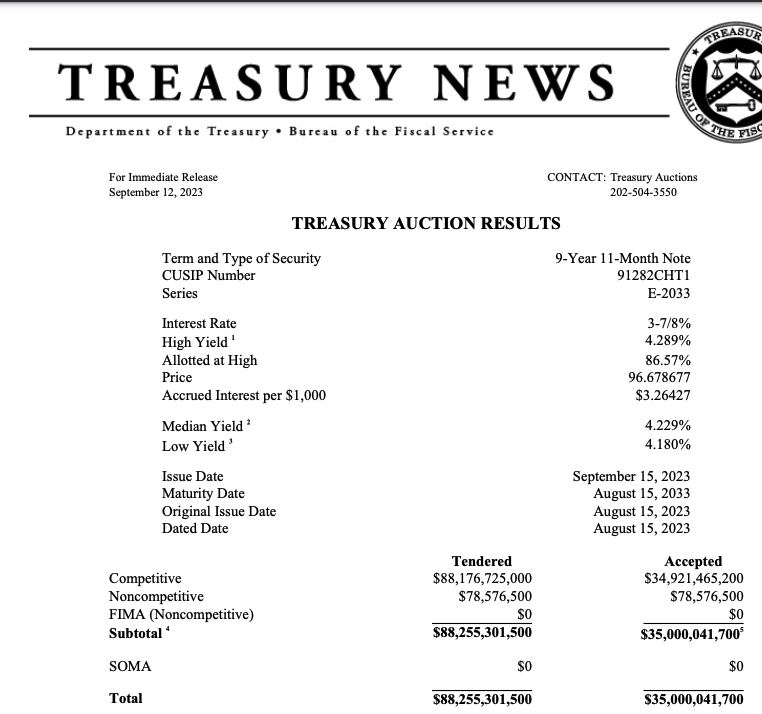
Food spend seems elastic and maintains a fairly flat percentage of spend, which implies that consumers either eat less, or make lower-cost choices for their 2,000 calories per day. Energy spend appears inelastic over the period, so if energy prices rise, so does relative spend. Spend on commodities, things like apparel and vehicles, has been rising consistently, last falling by 0.3% in 2019. This looks like a systematic shift to spending on goods. Services spend have the largest annual fluctuations, and don't seem to be impacted by services inflation. It could be as simple as people pay for energy and commodities first, then food, then spend the rest on services (and of course savings). Relative consumption changes for 2024 (Our best guess): - Energy prices are currently rising, and this will draw spend from other categories. - Food prices are rising, but consumption will continue to fall to keep this relatively flat. - Services inflation continues to rise with wages, but consumption will fall, maybe lowering the relative spend on this category. - Commodities inflation is near-zero, which may support flat consumption. Impacts on industries (our best guess): Retail (general, grocery and high-end) will see flat demand. Food establishments will see declining demand and margins. Services businesses will see higher wage costs and lower demand. Only the strong will survive. Energy prices rising (oil, gasoline, electricity and maybe not natural gas) takes first priority on spend. 4.289% yield on today's $88B US Treasury 10-year auction. None purchased by the NY Fed (SOMA). That is a high rate of interest the US Government will have to pay.
4.289% yield Free of state income taxes. The way to read this is that all bids at or under 4.289% yield were accepted. It is an auction, so if you bid a lower yield or interest rate, you earn less. So, it is a good indication that some market participants were willing to accept as low as 4.180%. That isn't that low either, only 11 basis points (or 0.11%) less than the high bid. We smell blood in the water. We expect higher yields on long-duration US Treasury bonds and notes. Inflation is just too high to expect these yields to drop within the next 12 to 18 months. By Jeffrey Cohen We are seeing US equity prices, commodity prices, and even the whole U.S. GDP rise amidst a choppy season in the markets.
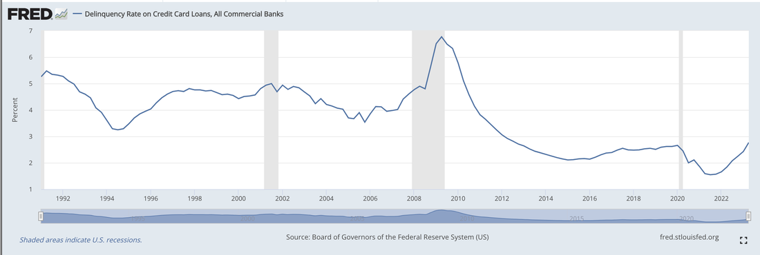
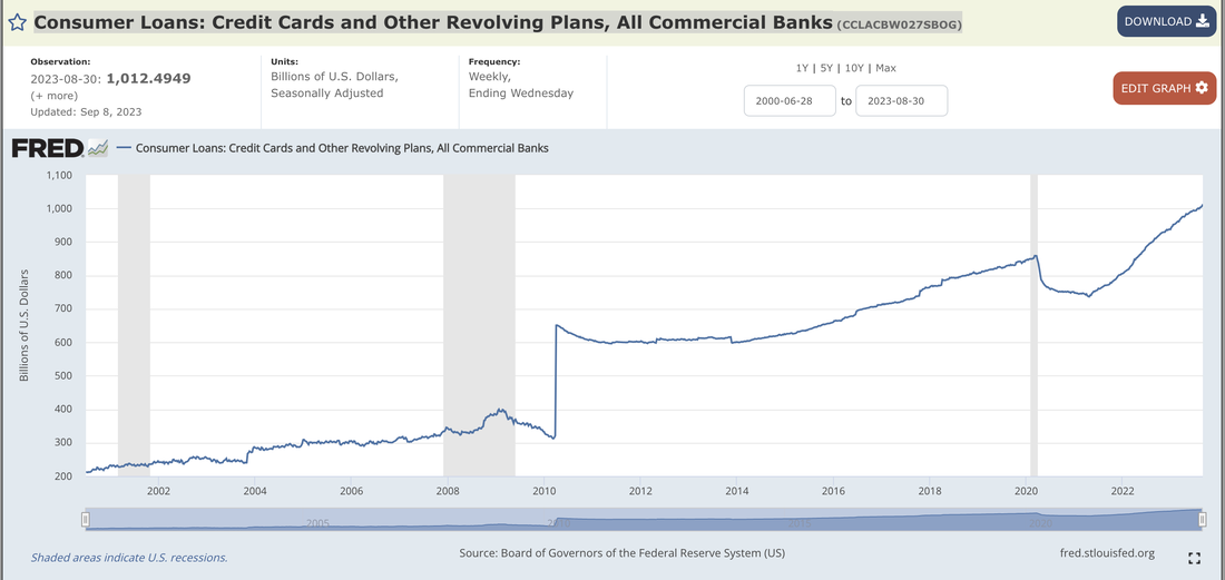
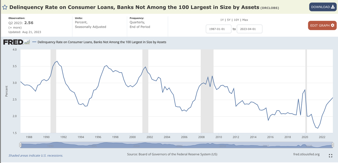
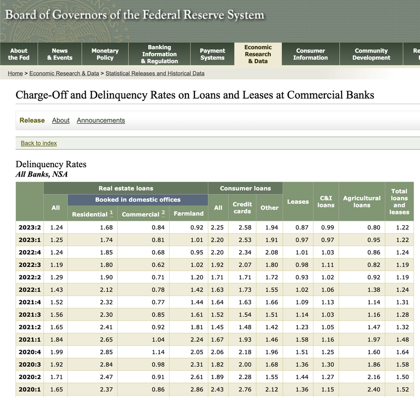
What does that say about the relationship between valuations and expected future interest rates? We doubt that the fundamental relationship has changed, so it must be the view on future interest rates. We think that interest rates are going to stay higher for longer. We are expecting a contraction in valuations. We see inflation as more 'sticky' and the US Federal and State Governments needing to borrow more, which drives up real interest rates. However, market valuations have been bouncing higher and lower. This is likely due to significant market disagreement on the levels of future interest rates. This is why people talk about the Fed Pivot, or when the Fed will start to lower policy interest rates. They think it is only a matter of a few months before rates are brought down to their 'appropriate' level. We have been tracking the market capitalization of ~3,000 US-listed common stocks, and their valuation is approaching $52T. This is pretty high. We have seen daily fluctuations of 4.5% this past week (see our webpage for details). This does not show up in the main indices, as those are designed to reduce volatility, but we see it in our detailed, comprehensive market data. Good luck to everyone in the markets. By Jeffrey Cohen We will walk through a few statistics on US consumer debt in this BLOG post. Delinquency Rate on Credit Card Loans, All Commercial Banks (DRCCLACBS) The Q2 2023 delinquency rate on credit card loans, all commercial banks (FRED (DRCCLACBS) dataset) is currently 2.77% last updated August 21, 2023. This rate used to fluctuate between 3.5% to 5% before the Great Financial Crisis, when it rose above 4% from the period of Q1 2007 to Q4 2010. It has remained below 3% for the past 11 years. To us, 2.77% is approaching the 'resistance level' of 3%, which indicates the US consumer credit distress. https://fred.stlouisfed.org/graph/?g=rRVR The interest rate on consumer credit cards has increased significantly. In May 2023, it reached 20.7% We take this to be either an average or a metric like a 'prime rate.' Source: FRED Commercial Bank Interest Rate on Credit Card Plans, All Accounts (TERMCBCCALLNS). In February 2022, the same rate was 14.6%. https://fred.stlouisfed.org/series/TERMCBCCALLNS The delinquency rate of credit card loans varies by the size of the bank issuing the card. For banks among the 100 largest in size of assets, the currently Q2 2023 delinquency rate is 2.63%. The delinquency rate for smaller banks is 7.51%. Here is the underlying data and notes: https://www.federalreserve.gov/releases/chargeoff/default.htm. The amount of credit extended to Consumers has also increased, reaching $1.01 Trillion US Dollars on August 30, 2023. This reading was updated on September 8, 2023. FRED Consumer Loans: Credit Cards and Other Revolving Plans, All Commercial Banks (CCLACBW027SBOG) and the link is https://fred.stlouisfed.org/series/CCLACBW027SBOG. Consumer debt was $859B just before the COVID pandemic, fell to $736B April 2021, and has risen by 36% in the past two and a half years. By way of comparison, Delinquency rates on all loans, banks not among the 100 largest by size, are still at historic lows of 0.95%. Delinquency rate on single-family residential mortgages, for all commercial banks, is a historic low 1.72%, a figure we have not seen since before the Great Financial Crisis in 2005. So, overall credit quality seems ok, especially when secured by business or real estate assets. Delinquency rate on consumer loans, made by banks not among the 100 largest in size by assets, have risen to 2.56%, which is up recently, but looks to be in the average range over the past 35 years. https://fred.stlouisfed.org/series/DRCLOBS. When compared to credit card loan delinquencies, this delinquency rate is significantly lower (2.6% vs. 7.5%) for the same sized banks. This either says that consumer loans are a better risk for smaller lenders, or that something is very broken with credit card debt issued by smaller banks. This same statistic for all commercial banks is 2.36%, which is up since 2021 and 2022, but low by historical standards. The spread between large and small banks is only 0.2%. If we look at delinquencies on all loans and leases, to consumers, on credit cards, the total is $23.8B, which is at the high end of the range of the data since 1992, but also seems pretty low overall. Asset Quality Measures, Delinquencies on All Loans and Leases, To Consumers, Credit Cards, All Commercial Banks (DALLCCACBEP). It is up 120% since Q2 2021. In short, the size of the credit delinquency problem has doubled since Q2 2021, and seems likely to continue to grow. This may be a 'tempest in a teacup' at current levels. However, if it continues to grow, it will soon become a black spot on the banking and consumer finance industry. One last look in this BLOG post is delinquency rates, for all banks, non-seasonably adjusted, since 2020. Here we see credit card debt, and other loan debt, for consumers. The credit card debt delinquency rate is growing, but has not quite reached the level in Q1 2020. The Other Consumer Loan level is in a similar situation, still below Q1 2020, but growing back to achieve that level. The other observation is that before the educational loan 'pause' in early 2022, these levels were the same. Recently, consumer loans have been a better risk, but we wonder if that spread will close again now that educational loans are incurring interest. We hope you enjoyed this blogpost and found it informative and helpful. We are doing this due diligence to better understand the underlying trends.
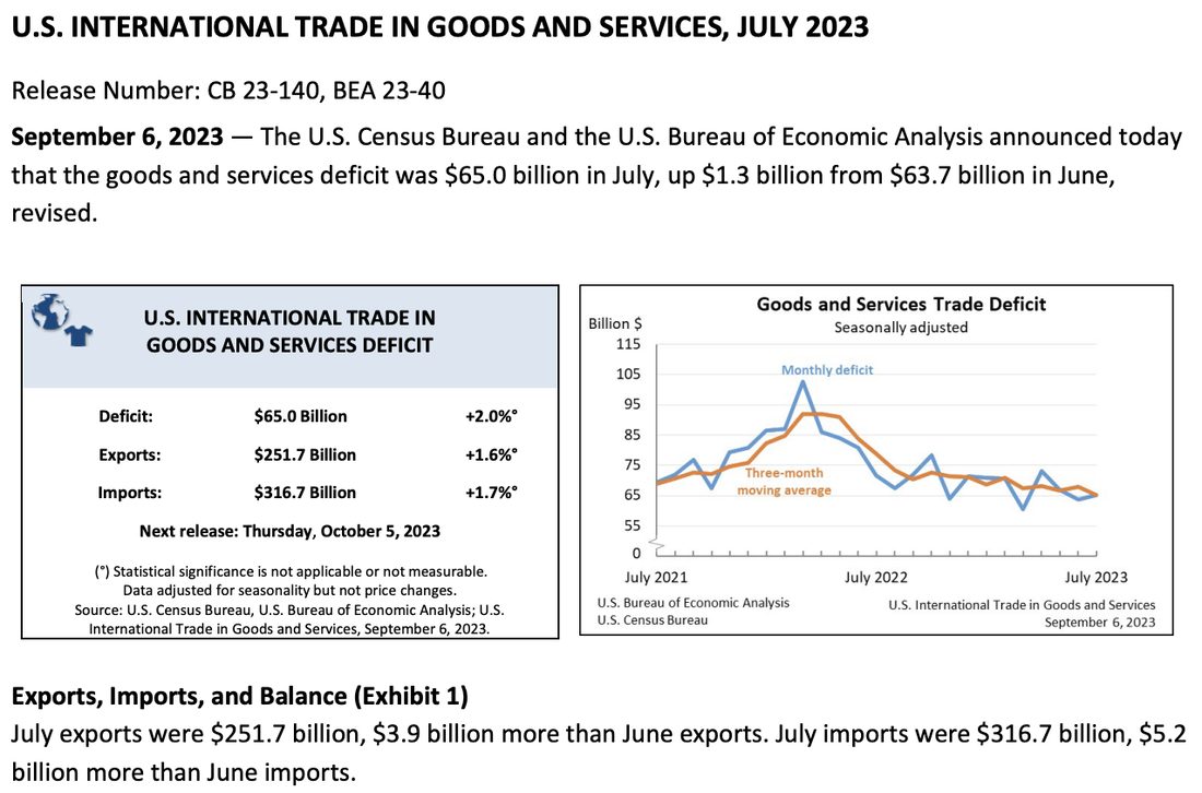
By Jeffrey Cohen The U.S. Department of Commerce, U.S. Census Bureau and Bureau of Economic Analysis publish international trade data each month. We know this data for the headline number: The Trade Deficit. The headline data shows that over the past year, imports are up 1.7%, exports are up 1.6%, and the Trade Deficit was up 2.0% to $65B. However, this does not tell the entire story. We look at the non-seasonably adjusted data published in exhibit 14 to see the monthly change in U.S. Trade in Goods by Selected Countries and Areas: 2023. We are curious to see the recent macroeconomic trends and try and better forecast inflation and economic growth. The first thing we notice is that U.S. exports fell by $7B and U.S. imports fell by $2B in July from June. This seems strange as we thought the US economy was growing, and the GDPNow estimate by the US Federal Reserve Bank of Atlanta is estimating the US Economy grew by 5.6% in Q2 2023. Something doesn't 'feel' right if the economy is growing at a fast clip, hours worked is declining, and now U.S. trade is declining.
In July, six countries sold or exported to the US significantly more goods than in June: China +$1,765M Japan +$894M Vietnam +$819M Germany +$786M Italy +$567M Indonesia +$412M In July, 5 countries bought, or imported from the US significantly more goods than in June: China $437M United Kingdom +$280M Japan +$180M Spain +$165M Thailand +$130M In conclusion, the United States did less trade with the rest of the world in July 2023 than it did the previous month. However, there were a few countries that went against that trend. China, Japan did more bilateral trade, while we focused on importing more from Vietnam, Germany, Italy and Indonesia, while we sold more goods to the United Kingdom, Spain and Thailand. We bought more than we sold in terms of the change, although that makes sense to a degree as the US buys more than it sells to the outside world overall. Despite all the 'tough talk' in Washington and Beijing, China became an even more important trading partner with the United States. The percentage of total U.S. goods trade grew, and it grew bilaterally. The growth of imports from Vietnam grew significantly, from $9.2B in June to $10.1B in July. However, exports to Vietnam declined from $0.73B to $0.71B. This is very one-sided trade. By Jeffrey Cohen The U.S. Bureau of Labor Statistics reported on September 7, 2023 that nonfarm business sector labor productivity increased 3.5 percent in the second quarter of 2023, seasonably adjusted.
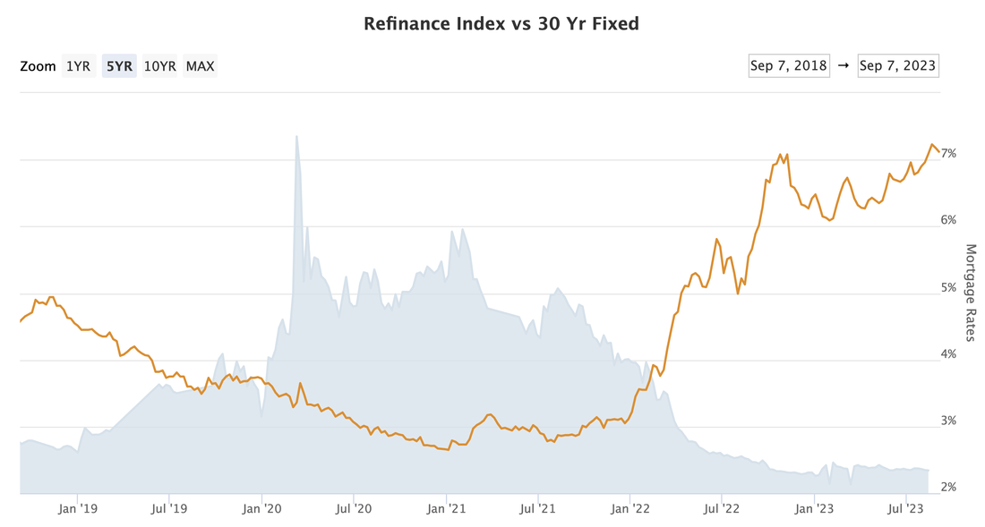
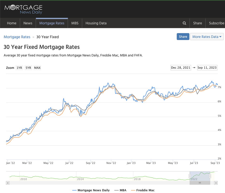
What are the major components of this highly productive quarter for the US economy: Output +1.9% Hours worked -1.5% --- Average weekly hours -1.5% --- --- Manufacturing -2.1% --- --- Business -1.3% --- Employment unchanged Unit labor costs +2.2% --- Hourly compensation +5.7% --- Productivity 3.5% Real hourly compensation (adjusted for inflation) +2.9% From April - June 2023, the number of US jobs was unchanged, but the average US employee worked fewer hours for more pay. Source: https://www.bls.gov/news.release/prod2.nr0.htm Thank you Mortgage News Daily for the chart. As seen below, over the past five years we are at peak mortgage rates over 7%, and we see refinance rates largely flat this year, but with volumes significantly lower from 2022. We see three concerns with this data from a macroeconomic perspective: 1. The companies that process mortgages are less busy, and mortgages become more stale (more years since credit underwriting). 2. US homeowners are not able to access the increased value of their homes without giving back some of those gains in higher future interest rates. 3. All homes become less affordable. If this translates into lower home sale levels, it impacts related economic sectors (e.g., real estate industry, mortgage, trust, legal, movers, home improvements and furniture). In July, single-family homes, townhomes, condominiums and coop apartments were down MoM and YoY, according to the National Association of Realtors (NAR). Mortgage News Daily data indicates that 30-year Fixed (conforming) mortgage rates today average 7.30%. This is up from ~3% in January 2022, a 4.3% increase that more than doubles the interest a home buyer would expect to pay over the life of their mortgage. In our analysis, this rate is based on the US Treasury 10-year and 7-year note yields, which are currently 4.3% and 4.4%. This implies a 3% credit spread, or markup, on home mortgages. In conclusion, interest rates and US residential mortgage rates are higher over the past 21 months, and this has reduced the volume of both home purchases and mortgage refinancing. The credit spread, or markup on conforming, 30-year fixed mortgages is 3% which reflects lender underwriting standards and overall industry competition.
If long-term interest rates continue to rise, and US consumer credit quality were to decline, we would expect a significant reduction in US housing activity. It is our opinion that the reduction in housing activity has not yet worked its way through US economic data as reported by the US Federal Government, and will have a negative effect on economic growth for the coming year. Jeffrey Cohen, US Advanced Computing Infrastructure, Inc. Chicago Quantum September 7, 2023 Conclusion, if we run our model only against profitable, low debt leverage company common stocks, we can find only 3 ticks of edge or alpha as compared to 21 ticks when we look at the whole universe of US listed stocks. In short, we lose the edge from quantitative analysis if we stick to lower risk stocks.
We run a quantitative model called the Chicago Quantum Net Score. It looks for long stock portfolios with a better risk-return trade off than the large passive US stock indices. It runs for a long time, crunches significant amounts of data, does serious number crunching, and uses advanced solver heuristics. It sometimes runs on a quantum computer, just to see what happens. We ran the model last night on September 6, 2023 in two versions. Thank you to our market data services provider, Intrinio, for providing us excellent, professional end of day data, along with historical financial information at high speed. There are some timing issues, as some of the historical data reflects prior periods (not sure the lag, but maybe up to a year). One version allows for all common stocks of US listed companies. We just opened up the data validation and we end up with 3,017 stocks that traded every day for the past year with a minimum volume of 20,000 shares and a positive BETA. The other version was more picky. Out of that group of 3,017 stocks we further require stocks to make a profit, have a positive common equity, and have debt that is a reasonable multiple of earnings. In short, these are the profitable, and lower risk stocks. The 'all stock' version found long stock portfolios of between 2 and 11 stocks, and the best portfolios had between 20 and 21 ticks of edge, or alpha. Holding all 3,017 stocks, or holding the SPY, QQQ or IWM both have zero edges. The 'profitable stock' version found long stock portfolios of between 2 and 8 stocks, and the best portfolios had three points of edge. That is not a material edge. Furthermore, one of the stocks picked, Velo3D, Inc. VLD, was profitable and no longer is. The model found stocks that have aggressive price movements, offsetting price changes, likely some closing stock price laddering or tape painting. Of note, Nvidia NVDA (computer hardware) is in a few of these portfolios, along with TTD (ad tech). In conclusion, if we only invest in profitable, lower debt companies with positive common equity, we lose the edge from quantitative analysis. It is interesting that the model picked NVDA and TTD, and really likes small cap stocks. If the model is allowed to evaluate all common stocks, it picks very risky stocks, but finds 7x to 8x the edge. Part of being an investment advisor is to help people make the right decisions for investing and/or trading. Buying profitable, under-leveraged stocks is lower risk. It comes at a price, where the total stock set trades at 20.0x net income and 4.48x common equity. Debt:Equity ratio is 0.61, and Debt:Market Cap ratio is 0.14. It is interesting that when we ran the model a few weeks ago with a lower leverage ratio (a 'tighter' filter), the Price / Earnings ratio was 60% higher (32), and the Price / Equity ratio was 15% higher (5.2). Common stock safety comes with a steep price. So, what should you do (without buying our services)? You could choose randomly from among some or all profitable companies listed on US stock exchanges, and hold an equal amount of each stock. If you are looking for safety, be prepared to accept a slightly lower expected return (1.5% p.a.) that comes with higher valuations and know that you would have suffered through 30% less volatility than if you choose unprofitable companies. You could also choose a combination of three US equity index ETFs, the SPY, QQQ and IWM. In terms of investing in unprofitable companies, this is where you should spend time researching companies and looking for an edge, as these stocks carry more risk, and as a group have higher expected returns. Our clients receive a list of stocks that have individually better (or worse) risk-return profiles, and portfolios of stocks that should provide an edge over the S&P 500, NASDAQ 100 or Russell 2000. Some of those stocks and profiles are meant to be held as long investments, and have a significant risk/return advantage based on historical price movements. Others are meant to be avoided or held as short positions, as they have much more risk for the return you would expect by holding them. Our clients also receive other stock lists that show the Chicago Quantum Net Score for every stock analyzed, and certain outliers like stocks with high skewness and high kurtosis, along with low variance. We also identify stocks with price spikes, volume spikes, and negative BETA. This is the question that keeps us up at night, hurts our short positions, and makes us wonder if this is the final hour of the Titanic, or a case of entrepreneurs buying the dip?
The first company we see is Applovin Corp, which has spent over a billion dollars in the past 3 months buying back stock. Our reading of their financial statements and SEC filings suggests that they have spent down their entire cash holding, except for around $75M, plus any cash generated in the past two months. They did also push out maturities to 2030 at a cost of ~$250M as they paid down outstanding debt. This was also done in the current quarter. The second we see is Pinterest, which is surprisingly similar in size and market, and they spent $500M in Q2 2023 buying back stock. We discovered Pinterest as Todd Morganfeld, the latest board member of Applovin, was the CFO of Pinterest when they initiated their stock buybacks despite weak operating results. After a quick look around, we wonder if this is a way to force a strategic buyer (e.g., Meta) to pay more for the company. There are likely many others. So, the question is why? Obvious answer: To make their stock price go up. Less obvious answer: Acquisitions and internal investments in growth have negative 'real' returns. Even less obvious: They don't buy the story of recession and rising interest rates and believe the consumer will keep spending, advertisers will keep spending, and the good times will last forever. Subtle answer: Both companies lose money, but less (losses are declining). So, they don't need to hold as much cash on hand to survive. They can operate more lean, assuming they continue to improve. What do we do as potential investors? Post your thoughts below...thank you for reading. By Jeffrey Cohen US Advanced Computing Infrastructure, Inc. We had economic news released that indicates the US macroeconomic slowdown in June and July 2023 may be over, and we are firming.
Three quick datapoints: - Job growth of 187k jobs in August, after revised lows in June and July, announced today. - Oil prices are up, now WTI trading at $85/bbl. Gasoline was higher, peaking in Mid-August. After a gap down, we see it rising again. - Interest rates are up significantly across the 2-30 year yield curve today (in the past few hours). Other news that is interesting, but less compelling. - There was a reading from ISM today that suggests firming in manufacturing, but it is unclear. - Inflation estimate from the FRB Cleveland (NowCast) is higher than expected for August MoM at 0.8%, and gasoline prices could be the culprit. I also saw electricity consumption scream higher in August MoM, which is likely a combination of usage and rates. - The VIX, or volatility index, is lower today despite the mixed economic news. This is likely driven by the actual, historical price variance being lower these past few days, weeks and months. The risk premium on volatility is dropping...again. We are positioned short in this market, so we want to see a monster under the bed. However, a look at markets and data suggests a balanced day where we see economic strength forming in August, higher interest rates to match it, and energy prices rising to 'soak up' any extra consumer personal income. Why would interest rates rise with economic activity? That's because real interest rates are restrictively positive and if inflation expectations rise, rates must rise with them to compensate new bond investments. If interest rates and energy continue to rise, we could see a very unmerry Christmas. Long portfolio choice: 5 stocks evenly held, and 18 points of edge.
['AFRM', 'CDLX', 'CKPT', 'CVNA', 'OPEN'] -0.001819 Long portfolio choice: 3 stocks evenly held, and 6 points of edge. ['APPS', 'MSTR', 'VLD'] -0.000568 We are four days into a US stock market rally before the Labor Day long weekend. If it continues to climb, these stocks should rise with it with a more efficient 'Sharpe-like' risk-return profile. These stocks work together in portfolios to further minimize portfolio risk, without sacrificing expected future returns more than they have to. We optimize a 'Sharpe-like' ratio of risk vs. return. These small portfolios are picked, along with 4,000 to 5,000 lines of market data. We also produce an excel spreadsheet with results for every stock that passes data validation. Why are the two portfolios different? The first portfolios has all stocks that pass 'loose' performance filters. As long as they trade and have a base amount of daily liquidity, they can make the list. Those stocks all lose money, for example. 2,965 stocks made the cut today for this analysis. This is a riskier universe of stocks, with higher historical price variance than the S&P 500 Equity Index ETF and the portfolio of profitable companies. The second portfolio is made of stocks that earn a positive net income, have more than -$1B in shareholder equity (so they cannot be more than a billion dollars in the hole for net worth of equity), and have long term debt that is less than 50 million times net income. 1,777 stocks made the cut today for this analysis. This is a lower risk universe of stocks, with more than 30% less historical price variance. |
Stock Market BLOGJeffrey CohenPresident and Investment Advisor Representative Archives
July 2024
|

 RSS Feed
